rebranding the lead vacation rental company of Europe
The story of NOVASOL is a exciting journey - it started with renting out norwegian skiing cabins in the sixties and quickly also dominated the business of Danish summerhouses as well. The name back then was Nordisk Ferie. Th (Bessermachen production)e company was a lead actor in establishing the standard way of spending the summer holidays - in a rental vacation home along the coasts of Denmark. By the 80’es it was not only Scandinavian houses but all over Europe and the name was changed to NOVASOL.
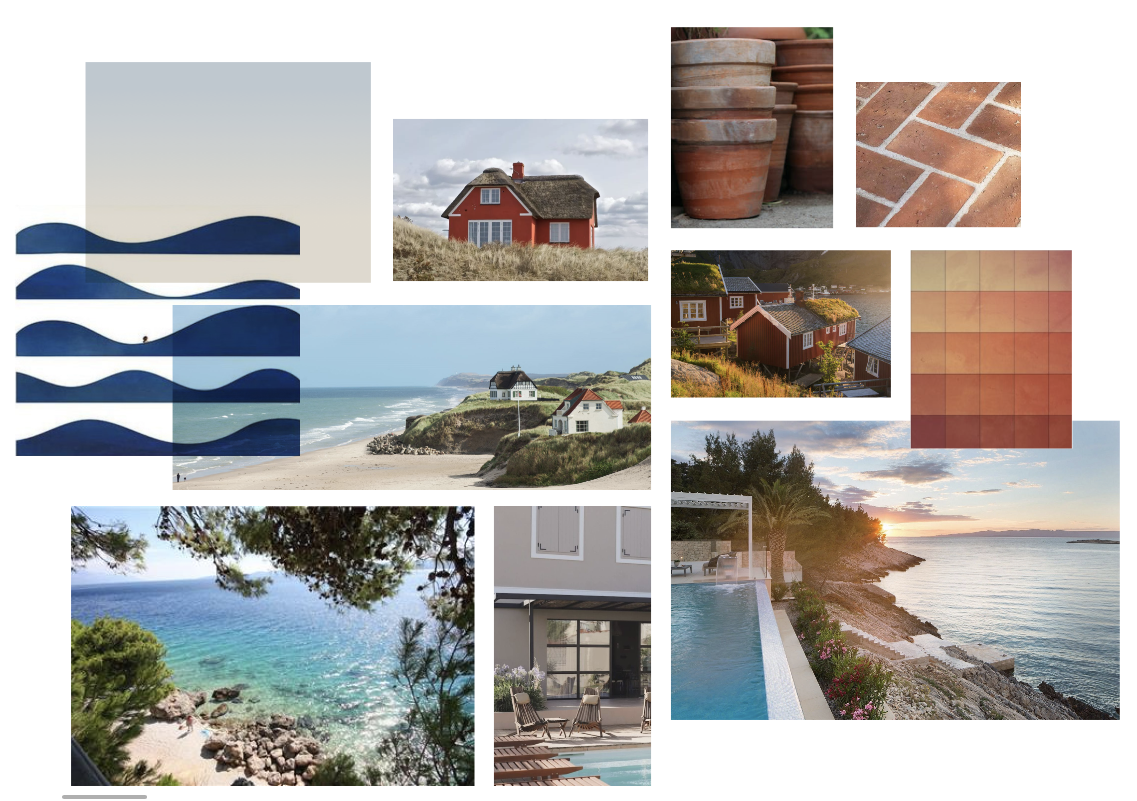
Today, the company is leading the business with over 40,000 properties across Europe. From snowy Norway of the North to the hot rocks of Croatia in the South.

modernizing the design and story of NOVASOL
To many, the summer houses vacation industry seem dated and dusty. But it is a thriving business, especially after covid. This kind of vacation style with freedom, slow pace and nature is well fitting our current wishes for more authenticy and sustainability. In 2021, NOVASOL needed to tell a more up to date story about their wonderful properties and the beauty of renting houses for a holiday. The challenge was to connect the story across Europe and not focus on the Danish heritage of the brand. Today, the company has an equal amount of properties in Danmark and in Croatia, so this was a story to connect not only the long coasts of Jutland but also the hot Mediterranean climate. The red was therefore redesigned into a warm terracotta shade to connect the story of houses and architecture from North to South. And using the blue hues and sand colours to complement the red.